This is of course easier said than done.
This thread is for us to discuss designs for a new logo. Please post your designs, and feel free to give comments, suggestions, etc. for other people's designs.
Let me start things off with my first design. It should look rather familiar to you. ;) (Håvard, you mentioned that you've made one based on the same logo, right? I'd love to see your take on it too.)
This is the first, black and white version. I am also going to work up a colour version, but I want to finalise this one first.
Also, take into account that the 2e and webring logos (or variations of them) should still be considered as 3e logo options.
Roger
Discussion in Roger's d20 project thread has revealed the need for a new logo - something inherently Mystaran that captures the feeling of the world we know and love.
This is of course easier said than done.
This thread is for us to discuss designs for a new logo. Please post your designs, and feel free to give comments, suggestions, etc. for other people's designs.
Let me start things off with my first design. It should look rather familiar to you. ;) (Håvard, you mentioned that you've made one based on the same logo, right? I'd love to see your take on it too.)
This is the first, black and white version. I am also going to work up a colour version, but I want to finalise this one first.
Cool!
I can't wait the coloured one!
This is exactly what I had in mind, though I never came as close as you did.
I'll still post my logos for inspiration though...

Håvard
OMG! Thorf.....that's great!!!

Roger
 Ack; As good as Thorf's first logo is, let's not set a precident of including large images in quotes... Please?
Colouring is a little bit of a daunting task, it seems, but I will have a go. Does anyone have any good parchment-style textures? I am always on the lookout for high resolution textures.
I'm not much of a CG artist, but here's an attempt at an "idea".... ignore the bright green, i forgot to mae it transparent before I uploaded it.
Roger, I have had similar ideas, but I have yet to come up with a design that works.
It would also be nice to incorporate the Known World, Hollow World and Savage Coast/Red Steel all into one logo, but that is also quite a hard design brief.
Regarding posting of old logos - my purpose for posting this thread is purely to share ideas, and come up with new logos as a group effort. So please, post any and all logos that you have designed or come across, as well as ideas for new ones, whether they are just words, concept sketches (like Roger just posted) or finished logos.
(Eventually I want to turn the most popular logos into vector art, so that we can rescale them freely and maintain high quality, but you don't need to worry about that too much for now.)
http://www.geocities.com/TimesSquare/Chasm/4270/add/logos/logos.html
Roger
I found these earlier today...
http://www.geocities.com/TimesSquare/Chasm/4270/add/logos/logos.html
Roger
Yeah, I remember those classic logos. I think they were from a fan contest to make a sort of official fan logo. Some of them are quire nice, but many are a bit rough, and even the nicer ones only look good on certain backgrounds. But I guess that will always be a problem.
Roger, I like your idea of trying to integrate the HW globe thingy. Keep experimenting with that concept!
Håvard
I found these earlier today...
http://www.geocities.com/TimesSquare/Chasm/4270/add/logos/logos.html
Ah ha! I knew one of the Mystara ladies had kept those logos somewhere. As Havard notes, they were indeed part of a contest by TSR for the fans of their "other world" settings to create logos that would be used as the "official" logos for those worlds. It was at a time when TSR was also attempting to create areas for fans to put up their creations to share and keep the worlds alive.
want to add highlights and shades to all the letters properly, but I haven't worked out how to do it yet.
This is the finished logo (I also updated the first image in this thread) placed on a parchment-like background.
And this is the colourised version. As you can see, it's just simple gradients for now.
I really like both and to be honest I can't even decide on which I like best. I wish I was even half as talented as some of you guys.
As far as parchment background- have you looked into just using the parchment background pattern in Word? It may be a bit too light colored for what you want, but I've always been sort of partial towards it.
Just a thought...Roger
Man- I like the old "Mystara Logo Contest" logo, but seeing these- I really am torn.
I wasn't around for the contest, I don't think, so I always wondered what that logo was. But I agree it's rather nice - like an expanded version of the AD&D "M" logo that includes the whole word instead of just the M.
My only problem with it is that we don't have a high resolution version. (I'm a stickler for image quality. It probably comes from being the son of a photographer, because my brother is the same.)
As far as parchment background- have you looked into just using the parchment background pattern in Word? It may be a bit too light colored for what you want, but I've always been sort of partial towards it.
I haven't seen Word's parchment, but it's not likely to be high resolution. The parchment background is the only non-vector part of my logo, which means that it can only be zoomed in so far before it starts to look pixelated. In order to show it at the sizes I've posted in this thread, the parchment needs to be a pretty big image to start with.
By the way, the current one is an image I found using Google Image search for "parchment", with image size set to large. The version on the coloured logo is slightly colourised to more closely match the original Gazetteer logo's parchment.
I know it's not on the Gaz logo, but I think the black border on the b/w logo would look good on the colored version.. maybe if it were golden or the same red color as the text? It would also prevent eye-strain when the logo is placed on a different colored b/g.. especially if the b/g is patterned...
Just a thought...Roger
That's something that I was thinking of doing myself, as it happens. Black looks quite strange, but another colour, such as red, looks quite good. You also hit the nail on the head for the reason that I left out the border, too.
I'm quite open to making variations, so I'll try to post a version with the border intact later.

Let me know what you think!
Håvard


Håvard
Both logos are great!
--Ray.
Regarding the colouring of the letters, you're basically working with the same set of filters as me, since Illustrator also includes the Photoshop filters. But as you can see, it's not all that easy to get the detail of the Gazetteer logo's colouring - it looks like it was done by hand originally.
If I could make a suggestion, why not leave the parchment as is? The pattern is a pretty close match to the Gazetteer logo's background. You can change the colouring and use filters with it to make it look even more similar, too. The problem with the pattern you used is that it's too small: you can see where it repeats, which takes away from the overall effect.
In any case, I like your text. I think it worked out better than my gradient. What filters did you use for it? Bevel and emboss? Perhaps a combination of filters?
Håvard, I like your logo. It's much more original than mine, which is basically just a direct copy of the Gazetteer one.
Thanks, I made it some time ago for a website project that just hasn't happened yet. My Blackmoor website has been suffering from too few updates itself so a new Mystara website will have to wait.
Regarding the colouring of the letters, you're basically working with the same set of filters as me, since Illustrator also includes the Photoshop filters. But as you can see, it's not all that easy to get the detail of the Gazetteer logo's colouring - it looks like it was done by hand originally.
Yeah, I think you are right. Perhaps we could ask Clyde Caldwell to help? ;)
If I could make a suggestion, why not leave the parchment as is? The pattern is a pretty close match to the Gazetteer logo's background. You can change the colouring and use filters with it to make it look even more similar, too. The problem with the pattern you used is that it's too small: you can see where it repeats, which takes away from the overall effect.
Point taken. Your parchment looks very good actually.
In any case, I like your text. I think it worked out better than my gradient. What filters did you use for it? Bevel and emboss? Perhaps a combination of filters?
Bevel and emboss, though I adjusted the depth and smoothness of the emboss filter to get the rounded off effect.
Also, the text has an "outer glow" filter.
Thanks to you and Ray for kind comments on both of my displays btw.
Håvard
Let me know what you think!
I think I will use it in my home-made PC sheets, so players will always remember they are from Mystara, and nothing like Toril, Oerth or Krinn!
I think I will use it in my home-made PC sheets, so players will always remember they are from Mystara, and nothing like Toril, Oerth or Krinn!
Thats a good idea Arcanda! I actually tried doing the same thing yesterday, but I found out Word is a terrible program for making character sheets. I'd love to see what you come up with if you want to share it
Håvard
Hope you like it....

Roger
Thats a good idea Arcanda! I actually tried doing the same thing yesterday, but I found out Word is a terrible program for making character sheets. I'd love to see what you come up with if you want to share it
Håvard
Of course I'll share it freely.
But... it is in excel format, I can't post it here. How to share it?
BTW: my PCs sheet is in Italian... would you like to see it anyway?
Of course I'll share it freely.
But... it is in excel format, I can't post it here. How to share it?
BTW: my PCs sheet is in Italian... would you like to see it anyway?
Ah, too bad.. I dont speak Italiano
Håvard
I'd love to see what you come up with if you want to share it
Håvard,
Goto http://www.rpgsheets.com and you will find a good 3.5 sheet in .doc format by Talmar. Just select "Dungeons and Dragons: 3rd Edition" from the drop down box. It's on the fourth or fifth page. There are other .doc sheets on the site too.
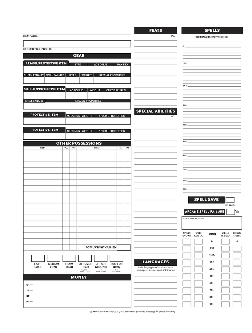
For those who are interested, I added Håvard's version of Thorf's Mystara logo to the character sheet. It can be downloaded from......
http://home.psknet.com/allenr/dnd/Mystara_Character_Sheet_35.zip
--Ray.
Like Arcanda, I too use an excell-generated character sheet. The one called HeroForge (4_0_4). It is one the most easy-to-use character generators I have tried so far (but do read the "readme"-file). Although the sheets looks are a bit standart (Yes it would be cool to have a official looking Mystara-sheet)
 .
.If you want to have a look at HeroForge you can download it from here:
http://www.dguys.net/heroforge/
-Jakob
In any event, Heroforge is a pretty good bit of design. Not the most elegant, but effective.
Just click on images to download
Regards
Gary
I have PaintShop Pro, not Photoshop... As I said befire, I'm not much of a graphic artist. Most of what I have done is made from patchworking everyone else's work...
On the Character sheet. The only thing I would change from the standard 3.5 CRS is the logo (of course); Deity-->Immortal; add EP and Gems/Jewelry to the Money & Treasure box, maybe seperate it to "Carried" "At Home" "Other" like in the DotE sheets.; and change the font of hte larger text. (The fine print is too fine to change without making it unreadable.)
I might also distinguish between "real age" and "apparent age" at the top...
But I'm on my lunch break now, so I don't have time to mess with it.
Roger
I think I like Thorf's new one best yet. The bevel isn't as deep, and will probably translate to a smaller size more easily. Also, your gold trim looks cleaner than mine. I tried a metallic look--and it works great until I try to resize.
My gold border is also supposed to be metal, though it is just a fancy gradient, really. I used highlights and shades as well as just a gold colour.
Resizing is a tricky business unless you're working with vector graphics. You have to be very careful, and it's best if you start big (the bigger the better) and resize to a smaller size using the right options (generally meaning anti-aliasing, bicubic sampling/resampling, etc.).
I have PaintShop Pro, not Photoshop... As I said befire, I'm not much of a graphic artist. Most of what I have done is made from patchworking everyone else's work...
Paint Shop Pro is a pretty powerful program too, although it doesn't have as many features as Photoshop or Illustrator.
Roger, when it comes to finalising your covers I would be happy to give you a helping hand. It would be good to make sure that they are as high quality as they can be, with all the elements fitting naturally into place.
On the Character sheet. The only thing I would change from the standard 3.5 CRS is the logo (of course); Deity-->Immortal; add EP and Gems/Jewelry to the Money & Treasure box, maybe seperate it to "Carried" "At Home" "Other" like in the DotE sheets.; and change the font of hte larger text. (The fine print is too fine to change without making it unreadable.)
I might also distinguish between "real age" and "apparent age" at the top...
If and when I finish reading the 3rd Edition rules, I will probably make a custom character sheet using one of my logos and more Mystaran fonts. (Yes, I am feeling myself more and more being pulled into 3rd Edition... It's an extremely surprising result, not at all what I was expecting when I bought the books.)
I think I like Thorf's new one best yet.
Yeah me too.
I'll change the sheet tonight if I get time.
Most of what I have done is made from patchworking everyone else's work...
Yeah me too. ;)
On the Character sheet.
Changed logo obviously, Added Immortal, I'll Add EP to treasure and maybe Gems/Jewellry. Personally, I don't know about Carried, At Home etc. I plan on changing the font on the larger characters whenever I get enough time.
Regards
Gary
If and when I finish reading the 3rd Edition rules, I will probably make a custom character sheet using one of my logos and more Mystaran fonts. (Yes, I am feeling myself more and more being pulled into 3rd Edition... It's an extremely surprising result, not at all what I was expecting when I bought the books.)
Based on this, and earlier posts, I think we both had a similar (if not the same) experience with our introduction to 3e, mine was simply earlier. After having played 3e for 2 years now, i feel that it's the best comprimise that could have been made between the freedom and "feel" (as abstract an idea as that is) of 0e with all the versatility and options of 2e... It really is the best of both worlds.... I still hate WotC for choosing the wrong 2 worlds to support (and for linking RPGs with TCGs in any way, form, or fasion--I ABHOR TCGs!) and I'm still partial to the old TSR logo, number of adventures published and thinking of Wisconsin as the center of the Multiverse--but that's just nastalgia. But I still give them my money, and 3e is a great product, despite my initial reservations... so the hate thing is nullified...

Roger
(Yes, I am feeling myself more and more being pulled into 3rd Edition... It's an extremely surprising result, not at all what I was expecting when I bought the books.)
:evillaugh
Muahahaha!!!! Ve haff brought another vun over to our side!!!
I really like 3E overall, although I will say that, compared to OD&D, it requires a lot more preparation time. It's definitely not as easy to just have a pickup game at a moment's notice, which is too bad.
I think every edition has something that I've liked, really- with the exception of 1E, which didn't seem to offer quite as much to me that the others didn't.
Gazza555 - love the character sheet! You have no idea how happy I am to be able to use a Mystara-specific character sheet; I can't wait to use them. However, I am unable to completely download page two. It only gets about 3/4 done when it says my connection has been reset.
 Anybody else having difficulties?
If you're open to possible modifications, I'd love to see birth date on there as well.
I am unable to completely download page two. It only gets about 3/4 done when it says my connection has been reset.
I don't know
 it's fine here.
 If you're open to possible modifications, I'd love to see birth date on there as well.
That should be easy enough to do.
Of course, as I've put the character sheet up as a png anyone can alter it to suit themselves. ;)
"Local common, + regional language, +1 per INT bonus."
How about "Regional Common" etc. or Regional languages +1 per INT bonus?
Regards
Gary
Of course, as I've put the character sheet up as a png anyone can alter it to suit themselves. ;)
Do I need any special programs? I'd be more than happy to mess around with it myself - I just need to know how.

I don't know why I couldn't completely download page 2 but its working just fine now. I had tried several times, went back to the first page which went fine, and tried page 2 again but no luck. At least its fixed now.
Do I need any special programs? I'd be more than happy to mess around with it myself - I just need to know how.
Any graphics editor that's less than 10 years old should be able to edit .pngs. The Gimp comes to mind. Take a look at the graphics section on Pricelessware. You'll find something to your liking.
http://www.pricelesswarehome.org/
--Ray.
One more thing to add/change to the Mystara CRS--Languages. If I'm not mistaken, the overwhelming consensus is that there is no Common language, as much as Thyatian is a common trade language.... So, change the language bar to read "Local common, + regional language, +1 per INT bonus."
That's the consensus? IMC I have always played with Thyatian being common; Glantrian, Darokinian etc are only dialects of Thyatian. OTOH, where another local language applies I have usually allowed both Thyatian and the local language for free. Hmmm...I guess that is sort of what you were saying...?
Thorf: I like the new logo too! If you want an even more metallic feel to the border, you might want to try bevel+emboss+texture with a very spread out texture on it...sort of like on the text of my Blackmoor logo (see website).
Just a suggestion.
Oh, and I'd like to see your character sheet too. So far I am enjoying Ray and Gary's two sheets!
Håvard
That's the consensus? IMC I have always played with Thyatian being common; Glantrian, Darokinian etc are only dialects of Thyatian. OTOH, where another local language applies I have usually allowed both Thyatian and the local language for free. Hmmm...I guess that is sort of what you were saying...?
Håvard
In my Mystara there is no more any "Common Tongue". Glantrian is the "common" of Glantri, but lots of local languages are alive. Thyatian is known in many places, but forget meeting an old village crone knowing it in any corner of the world!
First, one using Håvard's technique for metallic gold:
The other one is a version that stays true to the old Gazetteer logo, without borders.
First, one using Håvard's technique for metallic gold:
I really like this one. The metallic gold does it for me.
--Ray.
Still, it's nice to have various different versions, too. There's no reason not to support all these versions in the final release.
Regards
Gary
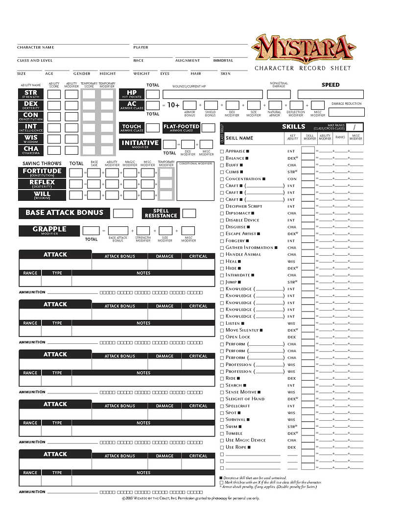
WotC have released a new version of the character sheet here. I've just downloaded it, and will, hopefully, Mystara-fy it.
Regards
Gary
I really like this new sheet they've got going! I'm looking forward to seeing your completed Mystara-fied version!
Håvard
I came across quite a nice sheet here that's in Word format,so it's easy to modify. The thread for the sheet is here.
Regards
Gary
I found this thread while looking for a fillable sheet for an Original D&D Mystara campaign. That's right we're using the old Rules Cyclopedia for this one.
I tried RPG sheets but no luck there. Any help would be apreciated.
Thanks,
Ed
I have one in Word format if you're interested. You might have to fiddle with it to make it look right, though - especially if you don't have the font I used for it.
Sure, please post it or e-mail it to me. My username at gmail.com
Thanks