
Colourised characters from the Red Box
by Roger LV Girtman IIInspired by this thread, I decided to try my hand at it. Since I was looking for apropriate colorized versions of my party anyway to use as tokens with MapTool, that's where I started. All of these characters are depicted in Mentzer's Basic set. I use them as my "Iconic characters", in addition to DMing these characters through Night's Dark Terror, and eventually WotI.
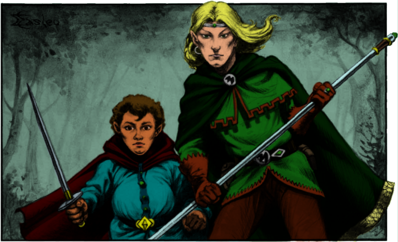
First up, Belrain, a Calarii elf, and Morgan Touchberry, a hin:
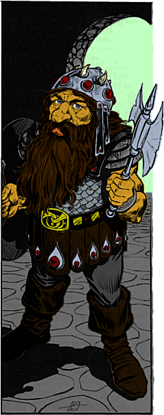
Next up, Rolf of the Stronghollow clan from Highforge:
Two more done, half-brothers Greegan and Felonius:
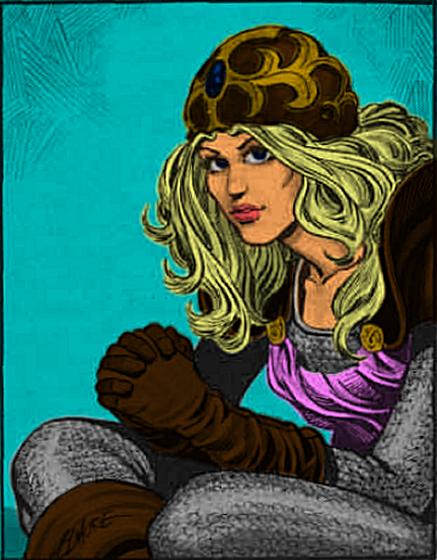
Here's another one: Clarion, cleric of Chardastes...
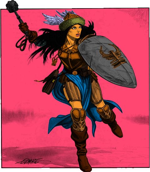
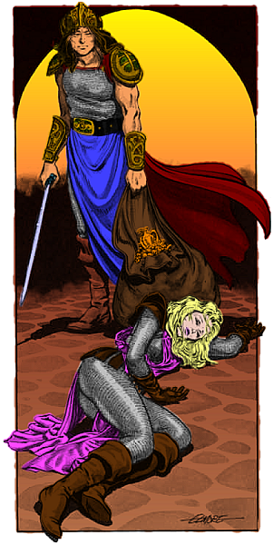
Finally, Bargle's nemesis and Aleena's close, personal friend... the party leader...
... Fleetwood of Threshold
So, what do y'all think... I had a lil bit of fun with this one, the background isn't all one color, but its still a muted tone... I'm not sure, but I think the whites of his eyes are a lil too bright.
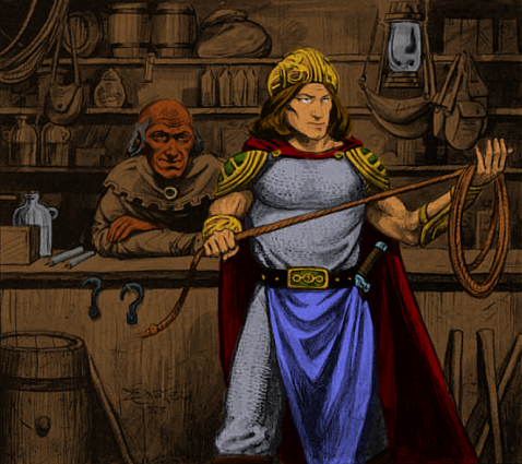
Now that the main group of PCs are done, I figured I'd try my hand at the rest of the red-box illustrations. This one is in homage to Andrew, which originally inspired Havard, and in turn, me, to do these pics in the first place.
Compare with maddog's avatar. For the visible portion, I used the same color scheme (if not neccessarily the same tinctures). The rest, I just made up, since I haven't seen 'Drew's original full-size image.
Looking at the differences, I think the method I've developed creates images akin to mid/late 80's color comic-books, rather than the "faux-oil paint" look I was originally trying to create. What do y'all think?
It didn't take as long as I thought it would to finish...
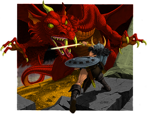
Compared to the original, at Mr. Elmore's site.
I couldn't get the various glints of light that the original has, but I think I did a good job on the fog coming off the treasure in the background.
A couple things I've learned from re-colorizing this image...
- "Red" dragon is a misnomer... they're actually ORANGE dragons. Seriously, I used a solid deep orange for the entire body of the dragon
- Glowing magical swords that emit a pale yellow-white light are, in truth, toothpaste-blue lightsabers
- Gold really is gold... I looked up "gold" on Wikipedia to get the right tint's hexcode
- The back wall (with the exception of the dark-gray tunnel entrance) is all one color: solid red. I swear, the black at the top-right and the burnt sienna on the far left is the same color--hexcode #ff0000
- Changing the lightness of a color by 1 point can make a significant difference in appearnace when applied to the right texture. The helmet, armor, and shield are all the same color of pale blue, seperated by 1 degree of lightness. (The same color blue as the sword, actually, but that's about 25 shades lighter)
- Caucasion skin color is, like "red" dragons, actually orange... Dragons just have better tans.
- A "couple things" really means "a half dozen, give or take one or two"... The idea that couple=two is a politically perpetuated myth.
I did this one a little rushed, so there is a bit more color bleed-through than my other images... but I think it created an interesting artistic effect, which is what I was going for.
Something a little simpler to keep your appetites up while I work on a more challenging item.
I'm using PaintShop Pro 7.02 (the last version released by Jasc before Corel bought the program).
After reviewing the video tutorials Havard used, these are the steps I performed:
- Import the illustration you want to colorize from whatever source
- Set the image to Grayscale to remove any random color flashes caused by a scanner, then increase the color depth to the maximum (normally 16 million colors).
- Create a duplicate of this image
- On the duplicate, adjust Brightness/Contrast until you get the amount of shadow detail you like (I used -15 Brightness and +30 Contrast), set this duplicate aside for later
- Go back to the original image and add a New Rastor Layer, using the "Multiply" Blend mode.
- Make sure your new layer is selected, then color the foreground to your heart's content--don't worry about shadow and highlights, or blending the colors, just focus on the main color being used. Your art will look very pixilated, and you might even have missed a few spots. Thats normal.
- When your foreground is colored, with the colored layer still selected, copy and paste as a new image. This new image should be just the solid colors on a transparent background
- On the new color-only image, pick a dull/neutral color for your background and flood-fill everything not yet colored (i.e. the transparency).
- Next, on the color-image, go to the Effects menu, and select "Blur More". This will blend your rough edges together, and cover up any missed pixels.
- After your colors are blended, copy, and go to the duplicate you set aside earlier.
- With the darker duplicate selected, select "Paste as a New Layer". You can now see your final product. The increased contrast of the duplicate creates the shadow for you, which is why you didn't have to worry about it earlier.
- Now "Merge All Layers"
- On your new single-layer image, from the Effects menu, select "Sharpen More" to clear out the last bit of fuzziness
- At last, you can save your file (I reccomend PNG file types).