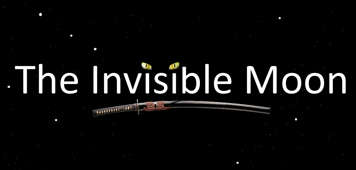
Invisible Moon logo
by Patrick SullivanI never saw the film and only vaguely remember advertising for it, but the second (white-on-black) definitely rings more of a "Invisible Man" bell for me. The first (white-on-black) feels a bit more engaging--I dislike the blur, but it draws me in.
I do kind of wish that this logo somehow harkened to Samurai or Ninjas or Rakasta. I don't have anything near your digital art skills, but I played around with it a bit and came up with an unsatisfactory germ of an alternate...

I don't have the skills to realize the vision, but if it sparks anything for you, feel free to run with it :)